The only way to gain proficiency in working with data is through experience. Theory can be important, but unless you have a decent amount of hands-on experience to draw upon, it will remain abstract, and you will be unequipped to handle the kinds of issues that present themselves when you work with real data in a practical way. The aim of these lessons is to provide self-contained scenarios where you can develop your Data Science Skills using real data and Python programming.
The task:
Display a boxplot for a dataset containing World GDP per Capita figures for 2017
Data source: https://www.worldometers.info/gdp/gdp-per-capita/
GDP per Capita
Gross Domestic Product (GDP) per capita shows a country’s GDP divided by its total population. The dataset used in this lesson lists nominal GDP per capita by country. It also includes data for Purchasing Power Parity (PPP) per capita, but we will not use it here.
Data file available here: World_GDP_Data_2017
The code in this lesson was written in a Juypter Notebook. This means it can be run sequentially using IPython. If you wish to use non-interactive Python you can create a .py file and run it as you normally would, omitting any special directives such as %load_ext nb_black. You may also need to add print statements in some situations to obtain output.
Creating Descriptive Statistics for GDP per Capita with Python
# Optional auto-formatting. Installation required (`pip install nb_black`)
%load_ext nb_black

# Import required modules
import pandas as pd
import numpy as np
import matplotlib.pyplot as plt
# Read data into a dataframe. The data file should be in the same directory as your script,
# or adjust the path to fit your directory structure.
# The raw data has no column headers.
df = pd.read_csv("World_GDP_Data_2017.txt", sep="\t", header=None)

# Display the first 5 items of the dataframe.
df.head()
| 0 | 1 | 2 | 3 | 4 | |
|---|---|---|---|---|---|
| 0 | 1 | Qatar | $128,647 | $61,264 | 752% |
| 1 | 2 | Macao | $115,367 | $80,890 | 675% |
| 2 | 3 | Luxembourg | $107,641 | $105,280 | 629% |
| 3 | 4 | Singapore | $94,105 | $56,746 | 550% |
| 4 | 5 | Brunei | $79,003 | $28,572 | 462% |
# Add headers so can reference the data by column name.
df.columns = ["rank", "country", "ppp", "nominal", "~world"]
df.head()
| rank | country | ppp | nominal | ~world | |
|---|---|---|---|---|---|
| 0 | 1 | Qatar | $128,647 | $61,264 | 752% |
| 1 | 2 | Macao | $115,367 | $80,890 | 675% |
| 2 | 3 | Luxembourg | $107,641 | $105,280 | 629% |
| 3 | 4 | Singapore | $94,105 | $56,746 | 550% |
| 4 | 5 | Brunei | $79,003 | $28,572 | 462% |
It’s going to be hard to work with the values in the nominal column as they are strings:
type(df.nominal[0])
str
so we are going to perform a conversion to make the values numeric.
# Convert `nominal` column data to float values using `replace` and regular expressions.
df["nominal"] = df["nominal"].replace({"\$": "", ",": ""}, regex=True).astype(int)
df.nominal.head()
0     61264
1     80890
2    105280
3     56746
4     28572
Name: nominal, dtype: int32
Now that we have numeric values for nominal GDP, we can use various methods to analyse and represent the data. A powerful pandas method for calculating descriptive statistics is describe():
df.nominal.describe()
count       190.000000
mean      14303.668421
std       19155.257580
min         293.000000
25%        2008.000000
50%        5765.000000
75%       16617.000000
max      105280.000000
Name: nominal, dtype: float64
This gives us some key values which give us insight into the data. A brief description of the values follows:
- count: How many data points were included?
- mean: What was the mean value? (The mean is one particular type of average.)
- std: How widely distributed are the values?
- min: The minimum value.
- 25%: Value beneath which 25% of the data falls.
- 50%: Value beneath which 50% of the data falls (the median).
- 75%: Value beneath which 75% of the data falls.
- max: The maximum value.
Boxplot for GDP per Capita
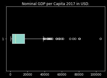
We can create a visual representation of the data using various types of graph. A boxplot is an excellent way to get a sense of how the data is distributed, and provides an easy way to understand some of its important properties. The vertical lines, from left to right, correspond to the following values from the descriptive statistics above: min, 25%, 50%, 75%, max. By default, matplotlib also shows outliers. These are data points which lie significantly beyond the bulk of the data in either direction, according to a set rule.
plt.boxplot(df.nominal, vert=False, patch_artist=True)
plt.title("Nominal GDP per Capita 2017 in USD.")
plt.show()
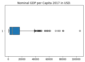
Now that we have a boxplot, it becomes quite easy to make some initial inferences about the data. For example, we can see that the data is positively skewed. If you haven’t learned what this means yet, just observe that the image is not symmetric about the median value (the 50% value from the table above), and consider what this might tell us about the data. We will look at skew in another lesson. We can also see that there are a significant number of outliers.
Now that you have a boxplot of the data and understand what the various components represent, have a good think about what it tells you about world GDP. Equally importantly, consider what it does not tell you. I encourage you to be tentative in your inferences, as a general operational principle, especially if you are new to data science, but also as you become more experienced. Overconfidence can be a serious problem in this field, and it’s important to understand the limits of valid inference.
This lesson has shown you how to create a boxplot and produce descriptive statistics for some real-world data, using Python. I hope you found it interesting and helpful.
Happy computing!
