Histograms are powerful tools for visualizing the distribution of data and identifying patterns and trends. In Python, several libraries, such as Matplotlib and Seaborn, allow you to create histograms effortlessly. This article will guide you through the process of creating histograms with numerous examples to demonstrate their versatility and applicability.
Introduction to Histograms
Before diving into the examples, let’s understand what histograms are and why they are essential. A histogram is a graphical representation of the distribution of a dataset. It divides the data into discrete bins and displays the frequency or count of data points falling into each bin. This visual representation allows us to understand the underlying data distribution, identify outliers, and explore patterns.
Don’t forget if you are working with the snippets in this article to make sure you have installed the required modules and imported them into your current file with the correct names.
Using Matplotlib for Histograms
Matplotlib is a widely-used plotting library in Python. It provides the hist function to create histograms easily.
Basic Histograms
import matplotlib.pyplot as plt

data = [1, 2, 2, 3, 3, 3, 4, 4, 5]
plt.hist(data, bins=5, edgecolor='black')
plt.title("Basic Histogram")
plt.xlabel("Value")
plt.ylabel("Frequency")
plt.show()
Customizing Histogram Appearance
# Add color and transparency to the bars
plt.hist(data, bins=5, edgecolor='black', color='skyblue', alpha=0.7)

# Add grid lines and set the range of x-axis and y-axis
plt.grid(True)
plt.xlim(0, 6)
plt.ylim(0, 4)

# Add labels and title
plt.title("Customized Histogram")
plt.xlabel("Value")
plt.ylabel("Frequency")
plt.show()
Creating Attractive Histograms with plt.style
Styling your histograms can significantly enhance their visual appeal and make them more engaging for your audience. Matplotlib provides various built-in styles to effortlessly transform the appearance of your plots. Let’s explore how to make your histograms attractive using plt.style and present some examples of different styles along with their descriptions.
Using plt.style to Apply Styles
To apply a style to your histograms, simply use the plt.style.use() function before creating the plot. This function takes the name of the style as a parameter and modifies the default appearance accordingly. The styles affect various elements such as colors, gridlines, fonts, and more.
import matplotlib.pyplot as plt

# Set the desired style before creating the plot
plt.style.use('style_name')
Examples of Styles:
‘classic’: Provides a classic, minimalistic appearance with simple lines and no gridlines.
‘dark_background’: Renders the plot with a dark background and bright contrasting colors.
‘ggplot’: Emulates the style of plots used in the ggplot library in R.
‘Solarize_Light2’: A light style with soft colors and clean lines.
‘fast’: Optimized for rendering quickly, especially useful for large datasets.
‘tableau-colorblind10’: Uses the Tableau palette designed for colorblind viewers.
‘grayscale’: A grayscale style with varying shades of gray for easy printing.
‘fivethirtyeight’: Replicates the style of plots found on the FiveThirtyEight website.
‘bmh’: A clean and pleasant style with thin lines and subtle colors.
‘seaborn’: Applies a style similar to the Seaborn library for enhanced aesthetics.
Choosing the Right Style
Selecting the most suitable style depends on your data, the context of your visualization, and your audience. For formal presentations or academic settings, you might prefer classic or grayscale styles. If you aim for a modern, eye-catching look, styles like dark_background, Solarize_Light2, or fivethirtyeight can be excellent choices.
Keep in mind that the aesthetics of your histogram should complement the story you want to convey, making it easier for viewers to grasp the insights hidden in your data.
By using plt.style, you can quickly experiment with different styles and find the one that best suits your data and visualization goals. So go ahead, explore the various styles, and create histograms that are not only informative but also visually appealing!
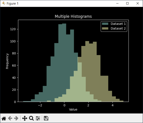
Multiple Histograms
import numpy as np

# Generate two datasets
data1 = np.random.randn(1000)
data2 = np.random.randn(800) + 2

# Plot two histograms side by side
plt.hist(data1, bins=20, alpha=0.5, label='Dataset 1')
plt.hist(data2, bins=20, alpha=0.5, label='Dataset 2')
plt.legend()
plt.title("Multiple Histograms")
plt.xlabel("Value")
plt.ylabel("Frequency")
plt.show()
Histogram with Density Curve
# Plot histogram with density curve
plt.hist(data, bins=5, edgecolor='black', density=True, alpha=0.7)
plt.plot(data, np.full_like(data, 0.2), '|k', markeredgewidth=1)
plt.title("Histogram with Density Curve")
plt.xlabel("Value")
plt.ylabel("Density")
plt.show()
Stacked Histograms
# Generate three datasets
data1 = np.random.randn(500)
data2 = np.random.randn(300) + 2
data3 = np.random.randn(200) + 4

# Plot stacked histograms
plt.hist([data1, data2, data3], bins=20, stacked=True, edgecolor='black')
plt.title("Stacked Histograms")
plt.xlabel("Value")
plt.ylabel("Frequency")
plt.show()
Logarithmic Scale Histograms
# Generate data with a wide range of values
data = np.concatenate([np.random.normal(10, 5, 500), np.random.normal(1000, 50, 50)])

# Plot histogram with a logarithmic scale on the x-axis
plt.hist(data, bins=50, edgecolor='black', log=True)
plt.title("Logarithmic Scale Histogram")
plt.xlabel("Value")
plt.ylabel("Frequency")
plt.show()
Creating Interactive Histograms with Plotly
Plotly is another powerful library that allows the creation of interactive plots. It provides the Histogram function to create interactive histograms.
Basic Interactive Histogram
import plotly.express as px

data = [1, 2, 2, 3, 3, 3, 4, 4, 5]
fig = px.histogram(data, nbins=5)
fig.update_layout(title="Basic Interactive Histogram", xaxis_title="Value", yaxis_title="Frequency")
fig.show()
Customizing Interactive Histogram
fig = px.histogram(data, nbins=5, opacity=0.7, color_discrete_sequence=['skyblue'])
fig.update_layout(title="Customized Interactive Histogram", xaxis_title="Value", yaxis_title="Frequency")
fig.show()
Grouped Interactive Histograms
# Create two datasets
data1 = np.random.randn(1000)
data2 = np.random.randn(800) + 2

# Create grouped interactive histograms
fig = px.histogram(pd.DataFrame({'Dataset 1': data1, 'Dataset 2': data2}), nbins=20, barmode='group')
fig.update_layout(title="Grouped Interactive Histograms", xaxis_title="Value", yaxis_title="Frequency")
fig.show()
Histogram with Slider Control
# Create time-series data
dates = pd.date_range(start='2023-01-01', periods=365)
data = np.random.randint(1, 100, size=len(dates))

# Create histogram with a slider control
fig = px.histogram(pd.DataFrame({'Date': dates, 'Value': data}), x='Value', y='Date', nbins=20,
                   animation_frame='Date', range_x=[0, 100])
fig.update_layout(title="Histogram with Slider Control", xaxis_title="Frequency", yaxis_title="Date")
fig.show()
Advanced Histograms with Seaborn
Seaborn is a high-level plotting library built on top of Matplotlib. It provides additional features for creating sophisticated histograms.
KDE Plot with Histogram
import seaborn as sns

data = [1, 2, 2, 3, 3, 3, 4, 4, 5]
sns.histplot(data, kde=True)
plt.title("KDE Plot with Histogram")
plt.xlabel("Value")
plt.ylabel("Density")
plt.show()
Rug Plot with Histogram
sns.histplot(data, kde=True, rug=True)
plt.title("Rug Plot with Histogram")
plt.xlabel("Value")
plt.ylabel("Density")
plt.show()
Categorical Histograms
# Create a categorical dataset
categories = ['A', 'B', 'C', 'A', 'B', 'C', 'A', 'B', 'C']
sns.histplot(categories, discrete=True)
plt.title("Categorical Histogram")
plt.xlabel("Categories")
plt.ylabel("Frequency")
plt.show()
Paired Histograms
# Generate two datasets
data1 = np.random.randn(1000)
data2 = np.random.randn(800) + 2

# Create paired histograms
sns.histplot(data1, alpha=0.5, label='Dataset 1', color='skyblue')
sns.histplot(data2, alpha=0.5, label='Dataset 2', color='orange')
plt.legend()
plt.title("Paired Histograms")
plt.xlabel("Value")
plt.ylabel("Frequency")
plt.show()
Histograms with NumPy and Pandas
NumPy and Pandas are essential libraries for data manipulation and analysis. They can be used to create histograms from arrays and data frames.
Histogram from NumPy Array
import numpy as np

data = np.random.randn(1000)
plt.hist(data, bins=20, edgecolor='black')
plt.title("Histogram from NumPy Array")
plt.xlabel("Value")
plt.ylabel("Frequency")
plt.show()
Histogram from Pandas DataFrame
import pandas as pd

data = pd.DataFrame({'Values': np.random.randn(1000)})
data.hist(column='Values', bins=20, edgecolor='black')
plt.title("Histogram from Pandas DataFrame")
plt.xlabel("Value")
plt.ylabel("Frequency")
plt.show()
Histogram with Binning
data = np.random.randn(1000)
plt.hist(data, bins=[-3, -2, -1, 0, 1, 2, 3], edgecolor='black')
plt.title("Histogram with Binning")
plt.xlabel("Value")
plt.ylabel("Frequency")
plt.show()
Histogram with Frequency Counts
data = np.random.randint(1, 6, size=100)
counts = np.bincount(data)
plt.bar(range(1, len(counts)), counts[1:], align='center', edgecolor='black')
plt.title("Histogram with Frequency Counts")
plt.xlabel("Value")
plt.ylabel("Frequency")
plt.show()
Handling Outliers in Histograms
Outliers can significantly affect the visual representation of histograms. Here are some techniques to handle outliers:
Truncated Histograms
data = np.random.normal(0, 10, 1000)
truncated_data = data[(data > -20) & (data < 20)]
plt.hist(truncated_data, bins=20, edgecolor='black')
plt.title("Truncated Histogram")
plt.xlabel("Value")
plt.ylabel("Frequency")
plt.show()
Clipped Histograms
data = np.random.normal(0, 10, 1000)
clipped_data = np.clip(data, -20, 20)
plt.hist(clipped_data, bins=20, edgecolor='black')
plt.title("Clipped Histogram")
plt.xlabel("Value")
plt.ylabel("Frequency")
plt.show()
Winsorized Histograms
from scipy.stats import mstats

data = np.random.normal(0, 10, 1000)
winsorized_data = mstats.winsorize(data, limits=[0.05, 0.05])
plt.hist(winsorized_data, bins=20, edgecolor='black')
plt.title("Winsorized Histogram")
plt.xlabel("Value")
plt.ylabel("Frequency")
plt.show()
Comparing Distributions with Histograms
Histograms are useful for comparing multiple distributions.
Overlaid Histograms
data1 = np.random.randn(1000)
data2 = np.random.randn(800) + 2

plt.hist(data1, bins=20, alpha=0.5, label='Dataset 1', edgecolor='black')
plt.hist(data2, bins=20, alpha=0.5, label='Dataset 2', edgecolor='black')
plt.legend()
plt.title("Overlaid Histograms")
plt.xlabel("Value")
plt.ylabel("Frequency")
plt.show()
Side-by-Side Histograms
data1 = np.random.randn(1000)
data2 = np.random.randn(800) + 2

plt.hist([data1, data2], bins=20, alpha=0.7, label=['Dataset 1', 'Dataset 2'], edgecolor='black')
plt.legend()
plt.title("Side-by-Side Histograms")
plt.xlabel("Value")
plt.ylabel("Frequency")
plt.show()
Stacked Density Histograms
data1 = np.random.randn(500)
data2 = np.random.randn(300) + 2

plt.hist([data1, data2], bins=20, alpha=0.7, label=['Dataset 1', 'Dataset 2'], stacked=True, density=True, edgecolor='black')
plt.legend()
plt.title("Stacked Density Histograms")
plt.xlabel("Value")
plt.ylabel("Density")
plt.show()
Violin Plot with Histogram
data1 = np.random.randn(500)
data2 = np.random.randn(300) + 2

sns.violinplot(data=[data1, data2], inner='hist', palette='pastel')
plt.title("Violin Plot with Histogram")
plt.xlabel("Dataset")
plt.ylabel("Value")
plt.show()
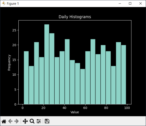
Histograms for Time Series Data
Histograms can also be used to analyze time series data.
Daily Histograms
dates = pd.date_range(start='2023-01-01', periods=365)
data = np.random.randint(1, 100, size=len(dates))

plt.hist(data, bins=20, edgecolor='black')
plt.title("Daily Histograms")
plt.xlabel("Value")
plt.ylabel("Frequency")
plt.show()
Monthly Histograms
dates = pd.date_range(start='2023-01-01', periods=365)
data = np.random.randint(1, 100, size=len(dates))
monthly_data = data.resample('M').mean().dropna()

plt.hist(monthly_data, bins=20, edgecolor='black')
plt.title("Monthly Histograms")
plt.xlabel("Value")
plt.ylabel("Frequency")
plt.show()
Seasonal Histograms
dates = pd.date_range(start='2023-01-01', periods=365)
data = np.random.randint(1, 100, size=len(dates))
seasonal_data = data.resample('Q').mean().dropna()

plt.hist(seasonal_data, bins=20, edgecolor='black')
plt.title("Seasonal Histograms")
plt.xlabel("Value")
plt.ylabel("Frequency")
plt.show()
Conclusion
Histograms are versatile tools for understanding the distribution of data. In this article, we explored how to create histograms using Python’s popular libraries, such as Matplotlib, Seaborn, Plotly, NumPy, and Pandas. We covered various customization options, handling outliers, comparing distributions, and analyzing time series data. Armed with this knowledge, you can leverage histograms to gain valuable insights from your datasets and communicate your findings effectively.