Python Flask is a micro-framework for creating web apps. It is very lightweight and easy to get started with, and also very popular. Since Flask is a web framework, it follows that working with it will require knowledge of HTML.
However, HTML on its own is very limited in terms of what it can do for the appearance of a web page. Sure, it controls the basic structure, and that is very important, but more is needed to create attractive designs that will appeal to your users and make them want to use your site for whatever purpose you created it for.
The key to controlling the appearance of a web-page is CSS – Cascading Style Sheets. CSS defines how HTML elements are to be displayed. It is a powerful tool, but it involves quite a learning curve to become proficient in.
There is a shortcut though, if you want to make visually stunning web-pages with the minimal amount of CSS!
Using Bootstrap 4 with Python Flask
In this article we are going to learn how to make a 1-page website using Python Flask and Bootstrap 4, as a springboard for you to dive into the wonderful world of easily styled Python Web apps. Lets’ make a start.
- If you haven’t already done so, install Flask from a command line using
pip install flaskon Windows orpip3 install flaskon Mac/Linux. - Create a new folder named “Python Flask Bootstrap Demo” somewhere convenient on your computer.
- Create a file called
app.py - Add the following contents:
from flask import Flask, render_template


app = Flask(__name__)


@app.route("/")
def main():
    return render_template('index.html')


if __name__ == "__main__":
    app.run()
- Create a folder called
templatesinside the current folder - Create a new file called
index.html - Add the following demo HTML code, adapted from the w3schools website:
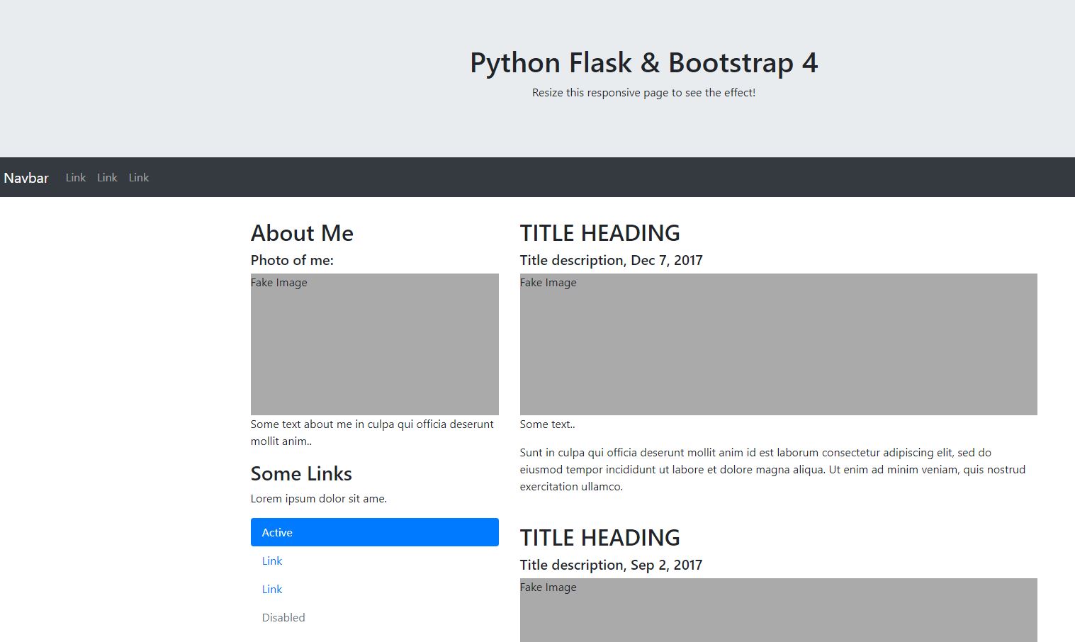
<!DOCTYPE html>
<html lang="en">
<head>
  <title>Python Flask & Bootstrap 4</title>
  <meta charset="utf-8">
  <meta name="viewport" content="width=device-width, initial-scale=1">
  <link rel="stylesheet" href="https://maxcdn.bootstrapcdn.com/bootstrap/4.5.2/css/bootstrap.min.css">
  <script src="https://ajax.googleapis.com/ajax/libs/jquery/3.5.1/jquery.min.js"></script>
  <script src="https://cdnjs.cloudflare.com/ajax/libs/popper.js/1.16.0/umd/popper.min.js"></script>
  <script src="https://maxcdn.bootstrapcdn.com/bootstrap/4.5.2/js/bootstrap.min.js"></script>
  <style>
  .fakeimg {
    height: 200px;
    background: #aaa;
  }
  </style>
</head>
<body>

<div class="jumbotron text-center" style="margin-bottom:0">
  <h1>Python Flask & Bootstrap 4</h1>
  <p>Resize this responsive page to see the effect!</p>
</div>

<nav class="navbar navbar-expand-sm bg-dark navbar-dark">
  <a class="navbar-brand" href="#">Navbar</a>
  <button class="navbar-toggler" type="button" data-toggle="collapse" data-target="#collapsibleNavbar">
    <span class="navbar-toggler-icon"></span>
  </button>
  <div class="collapse navbar-collapse" id="collapsibleNavbar">
    <ul class="navbar-nav">
      <li class="nav-item">
        <a class="nav-link" href="#">Link</a>
      </li>
      <li class="nav-item">
        <a class="nav-link" href="#">Link</a>
      </li>
      <li class="nav-item">
        <a class="nav-link" href="#">Link</a>
      </li>
    </ul>
  </div>
</nav>

<div class="container" style="margin-top:30px">
  <div class="row">
    <div class="col-sm-4">
      <h2>About Me</h2>
      <h5>Photo of me:</h5>
      <div class="fakeimg">Fake Image</div>
      <p>Some text about me in culpa qui officia deserunt mollit anim..</p>
      <h3>Some Links</h3>
      <p>Lorem ipsum dolor sit ame.</p>
      <ul class="nav nav-pills flex-column">
        <li class="nav-item">
          <a class="nav-link active" href="#">Active</a>
        </li>
        <li class="nav-item">
          <a class="nav-link" href="#">Link</a>
        </li>
        <li class="nav-item">
          <a class="nav-link" href="#">Link</a>
        </li>
        <li class="nav-item">
          <a class="nav-link disabled" href="#">Disabled</a>
        </li>
      </ul>
      <hr class="d-sm-none">
    </div>
    <div class="col-sm-8">
      <h2>TITLE HEADING</h2>
      <h5>Title description, Dec 7, 2017</h5>
      <div class="fakeimg">Fake Image</div>
      <p>Some text..</p>
      <p>Sunt in culpa qui officia deserunt mollit anim id est laborum consectetur adipiscing elit, sed do eiusmod tempor incididunt ut labore et dolore magna aliqua. Ut enim ad minim veniam, quis nostrud exercitation ullamco.</p>
      <br>
      <h2>TITLE HEADING</h2>
      <h5>Title description, Sep 2, 2017</h5>
      <div class="fakeimg">Fake Image</div>
      <p>Some text..</p>
      <p>Sunt in culpa qui officia deserunt mollit anim id est laborum consectetur adipiscing elit, sed do eiusmod tempor incididunt ut labore et dolore magna aliqua. Ut enim ad minim veniam, quis nostrud exercitation ullamco.</p>
    </div>
  </div>
</div>

<div class="jumbotron text-center" style="margin-bottom:0">
  <p>Footer</p>
</div>

</body>
</html>
- Run
app.py - You will see a message like this:
Serving Flask app "flask-hello" (lazy loading)
Environment: production
WARNING: This is a development server. Do not use it in a production deployment.
Use a production WSGI server instead.
Debug mode: off
Running on http://127.0.0.1:5000/ (Press CTRL+C to quit)
- Navigate to
http://127.0.0.1:5000/in your browser, and ta da there should be your Bootstrap 4 Demo homepage, served by Python Flask.
The details of how Flask works are not the subject of this article, but there is plenty of information available online for the curious, and we will probably cover Flask here on Compucademy in the near future.
What I want to do here is encourage you to explore the boilerplate code provided and begin to understand how it works. You should change things, break things, move things around and generally get your hands dirty. It will take a bit of time to become proficient with Bootstrap, but it is surprisingly quick and easy to make beautiful designs once you have understood some basics.
To get you started here are a few pointers:
- Bootstrap can be included via a remote server (CDN) or from your own project files after you have downloaded them
- In this example it is included via
<link rel="stylesheet" href="https://maxcdn.bootstrapcdn.com/bootstrap/4.5.2/css/bootstrap.min.css"> - The JavaScript parts of Bootstrap are not always needed. I’ve left them in so you can see how to include them.
- You should generally used the latest versions of the CSS and JS, available here.
- The CSS styling is applied through
classesadded to html elements. These classes have pre-defined CSS defined on them. - Some example classes are: —
container: used to wrap around a collection of elements which you want to apply Bootstrap classes to —row: used to separate content into horizontal rows —col-sm-8: uses the powerful Bootstrap grid system to control grid-based layouts. This example means “on small devices and below (down to xs – extra small) this element takes up 8 out of 12 column units.” I.e. it will cover 2/3 of the available horizontal space, since Bootstrap is based on a 12-column division of rows. —navbar navbar-expand-sm bg-dark navbar-darkgives you all the styling you need to create a smart responsive navigation menu.
Separation of Style from Layout with Bootstrap 4
One thing that you may notice about the way Bootstrap works is that the often recommended separation of style from layout is not actually kept to. This is because when writing your HTML, you set classes which have names which are semantically meaningful in terms of their visual behaviour. If you were strictly separating style from layout you would need to do something like <div class="div-number-1"> and then you would have the freedom to display that div in anyway you saw fit without being concerned by the fact that is is for example supposed to function as a row. This is not an important issue in practice though so don’t let it worry you. It is really just an observation.
So there you have it – a springboard to making amazing looking Flask apps quickly and easily using Bootstrap 4. I hope you have fun with it, and if you want to keep up to date with articles and offers from Compucademy, please consider joining our mailing list.
Happy computing.
