Data visualization is an essential skill for data scientists and analysts. While libraries like Matplotlib and Seaborn are great for static charts, Dash allows you to create interactive web-based visualizations in pure Python—no JavaScript required!
What is Dash?
Dash is a powerful Python framework for building interactive web applications. Developed by Plotly, Dash simplifies the process of creating data-driven applications without requiring frontend expertise.
Why Use Dash?
- Pure Python: No need for HTML, CSS, or JavaScript.
- Highly Customizable: Built-in support for Plotly charts and various UI components.
- Interactive: React to user inputs dynamically.
- Easy to Deploy: Can be hosted on any web server.
📢 Learn Dash for Data Analytics Today!
💡 Master interactive data visualization and build powerful dashboards with Dash. Check out my comprehensive course on LinkedIn Learning:
➡️ Data Visualization in Python with Dash
By taking this course, you’ll learn how to build eye-catching interactive dashboards from real world datasets.
Getting Started with Dash
To install Dash, simply run:
pip install dash
Creating a Basic Dash App
Below is a simple Dash application that displays an interactive line chart:
import dash
from dash import dcc, html
from dash.dependencies import Input, Output
import plotly.express as px
import pandas as pd

# Sample data
df = px.data.gapminder()

app = dash.Dash(__name__)
app.title = "Interactive GDP Dashboard"

# App layout with CSS styling
app.layout = html.Div([
    html.H1("🌍 GDP Over Time", style={'textAlign': 'center', 'color': '#2c3e50', 'fontFamily': 'Arial'}),
    html.P("Select a country to view its GDP trends:", style={'textAlign': 'center', 'color': '#34495e'}),

    dcc.Dropdown(
        id='country-dropdown',
        options=[{'label': c, 'value': c} for c in df['country'].unique()],
        value='United States',
        style={'width': '50%', 'margin': 'auto'}
    ),

    dcc.Graph(id='line-chart', style={'marginTop': '20px'}),

    html.Footer("Built with ❤️ using Dash & Plotly",
                style={'textAlign': 'center', 'padding': '10px', 'color': '#7f8c8d'})
])

@app.callback(
    Output('line-chart', 'figure'),
    [Input('country-dropdown', 'value')]
)
def update_chart(selected_country):
    filtered_df = df[df['country'] == selected_country]
    fig = px.line(filtered_df, x='year', y='gdpPercap',
                  title=f'{selected_country} GDP Over Time',
                  markers=True, line_shape='spline')
    fig.update_layout(template='plotly_dark', margin={'l': 40, 'r': 40, 't': 40, 'b': 40})
    return fig

if __name__ == '__main__':
    app.run(debug=False)
Output:

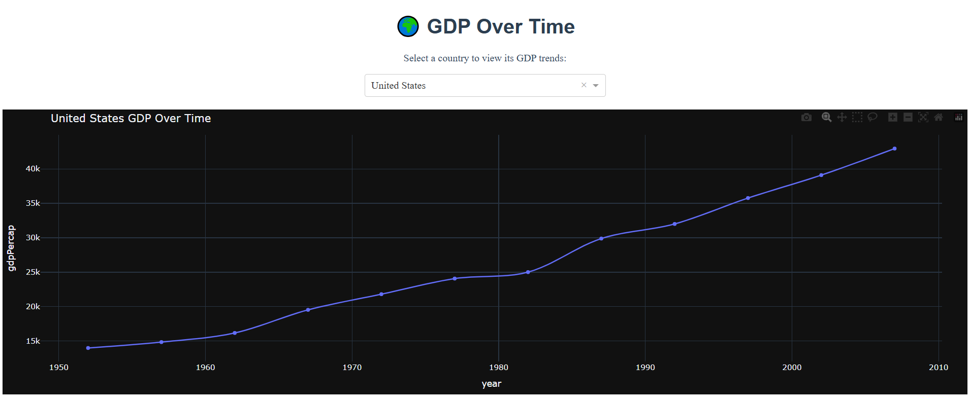
This app features: – Stylish headers & descriptions for better user experience. – A centered dropdown menu for better accessibility. – A dark-themed, smooth line chart with markers.
Advanced Dash Features
- Dash Core Components (dcc): Pre-built interactive elements like dropdowns, sliders, and graphs.
- Dash HTML Components (html): Standard HTML elements for structuring the layout.
- Callbacks: Enables interactivity by linking inputs and outputs dynamically.
- Multi-page Applications: Organize large applications efficiently.
- Deployment: Deploy with Flask, Heroku, or Docker.
📢 Learn Dash for Data Analytics Today!
💡 Master interactive data visualization and build powerful dashboards with Dash. Check out my comprehensive course on LinkedIn Learning:
➡️ Data Visualization in Python with Dash
By taking this course, you’ll learn how to build eye-catching interactive dashboards from real world datasets.

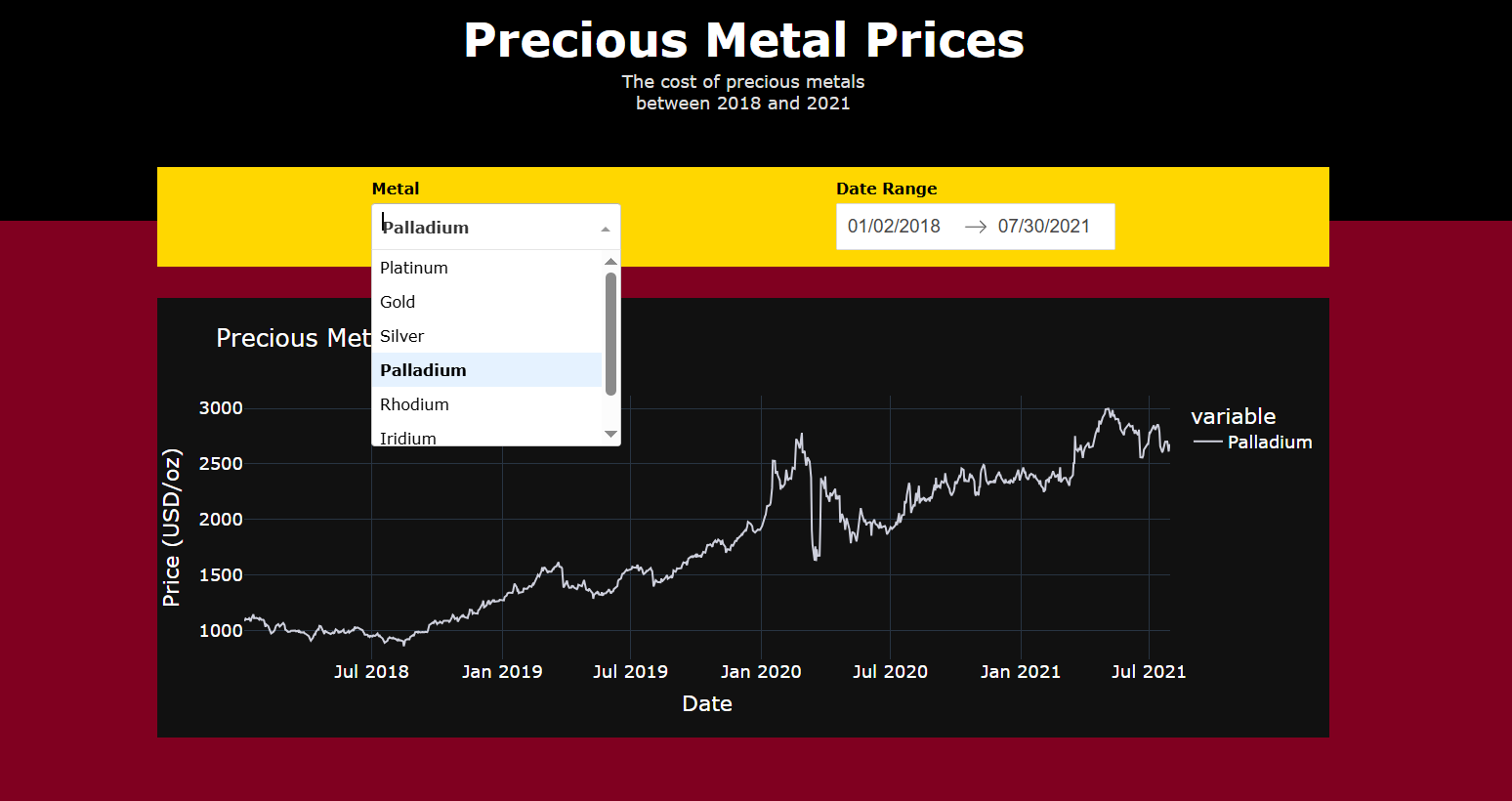
This app lets users select a metal and a daterange to see its performance over time. The course linked above will teach you everything you need to build this app from scratch (or should I say, from Dash?)
Dash is an excellent tool for bringing data to life with interactivity and ease of use. Start experimenting today and elevate your data storytelling with Python!
